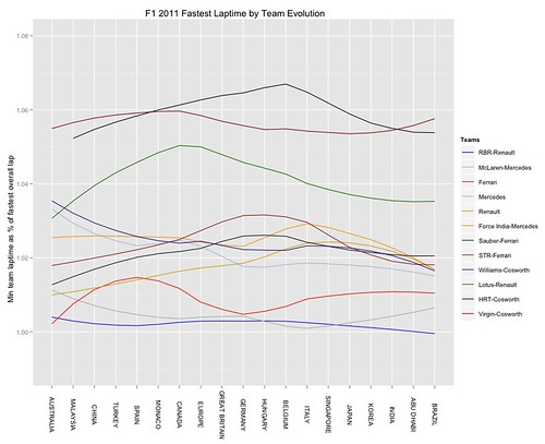
The following chart shows a loess model of the minimum laptimes recorded by each team as a percentage of the fastest overall laptime recorded for each race:

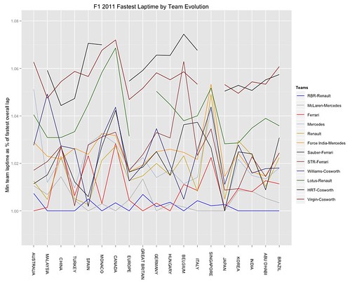
This approach may mask which team set the actual fastest lap for each race, of course. So to see the evolution of actual fastest laptimes recorded by each team as a percentage of the overall fastest lap set in each race, we need a more literal plot (results are thresholded to only show results within 108% of the fastest laptime set in each race):

So - a useful plot, or not (e.g. in the sense of writing an end of year review?)? Is the fastest relative laptime set per team actually a useful indicator of a team's progress, or not? Would it be useful to generate this sort of chart following each race during a season, as an indicator of team progress?
Next up, comparing the fastest laptimes between two arbitrary teams... err.. maybe...?!
PS Err, not, actually. Instead, F1 2011 Review - Qualifying Progress
I like the loess graph - things become so much more apparent. It would probably work well by annotating important car updates on the graph (more on the journalist side of things perhaps).
ReplyDeleteHow well does the fastest lap time correlate to qualifying position? Both loess "smoothed"?
@HenningO I'll try to post some qualifying charts within next couple of days... As to annotating the charts - that's something I need to learn how to do... got any pointers?!;-)
ReplyDelete