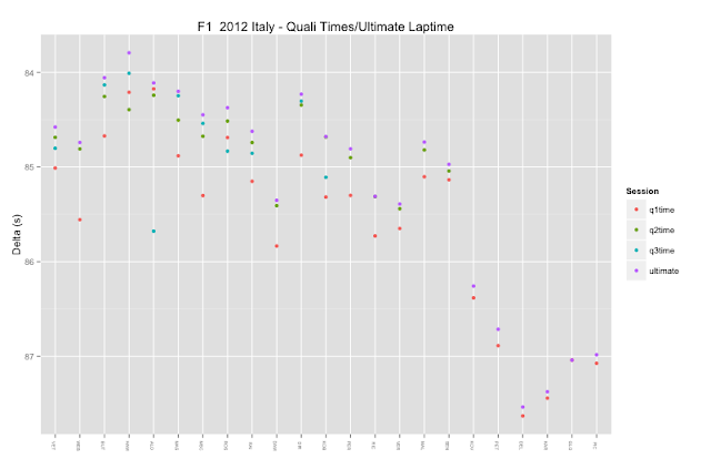
A driver's ultimate lap time in qualifying is the sum of their best sector times recorded throughout qualifying. The following charts explore how close the drivers got to these notional times. The quickest/easiest charts to generate are simple scatterplots - here we see HAM was some way off his ultimate laptime (the y-axis is the delta, or difference, between the ultimate laptime and each session best time).
The following chart shows the actual recorded session best laptimes and the notional ultimate laptime. This chart helps us see what the gird might have looked like if each driver qualified with their ultimate laptime. (I guess I should put in horizontal lines showing the notional cut-offs for the top 3, top 10 and top 17 based on the ultimate times? Maybe also a chart showing actual rank vs. rank based on ultimate laptime?)
The following chart finds the difference between the fastest laptime recorded in each qualifying session the driver participated in and their ultimate laptime (calculated as the sum of the fastest sector times recorded for each driver throughout the whole of qualifying).
What the chart shows is how close to their own perfect lap the drivers came throughout qualifying. By using a common referent for each session (the ultimate laptime across the whole of the session), we can see how the drivers performances compared across sessions.The following chart is far from ideal, but it starts to explore the differences in performance between drivers in the same team. In particular, it shows the delta between a driver and his team mate in each session. So for example, WEB trailed VET in Q1 and Q2, HAM trailed BUT in Q2, but beat him in Q1 and Q3, etc.
What this suggests to me is a chart with one panel per team, and three horizontal elements per panel, with driver 1 to the left and driver 2 to the right of the mid point, then a horizontal bar showing the delta. So for example, if driver 1 was 1s behind driver 2, we would have a bar going 1s to the left. If driver 2 was 2s behind driver 1, the bar would go 2s to the right.
In the following chart, we look at the deltas between each driver's qualifying session time and the ultimate laptime for the same team across all sessions. The idea is that we see how far off the ultimate performance for that team each driver was in each session.
As well as looking at deltas relative to ultimate laptimes, we can also take a more natural look at how personal bests in each session compared to the best overall time in the session:
This makes it clear, for example, that ALO was dominant in Q1 and Q2 with BUT and HAM close behind in those sessions. One thing I need to learn to do is place some sort of mark in each session denoting the driver who got the fastest time in that session (i.e. a zero delta to the best time, compared to the NULL zeroes for drivers who didn't make it into a session).
Here's how the personal best times across all sessions compare to ultimate laptimes for each driver - this chart gives us two alternative takes on the qualifying rank: the order if drivers achieved their fastest time in their last session (read the rank left to right), and the ranking according to ultimate laptime (read bottom to top). The x=y line shows where personal best and ultimate times match. The distance away from the line shows how far off the ultimate laptime the best time was. The colour is proportional to the delta between the personal best and personal ultimate laptimes:


No comments:
Post a Comment
There seem to be a few issues with posting comments. I think you need to preview your comment before you can submit it... Any problems, send me a message on twitter: @psychemedia