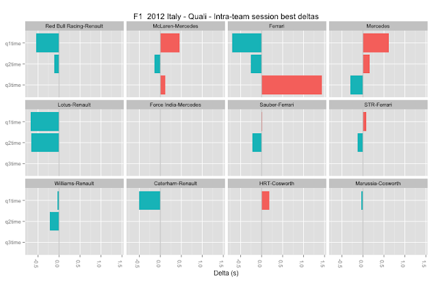
So for example, in the chart below, I find the difference (delta) between the qualifying times of driver1 and driver2 in each team and plot the result. If the bar goes to the left of the origin (greenish) it shows driver1 was the displayed time ahead of/faster than driver2 (ie driver1's time was -N seconds away from driver2's time). If it goes right (red/orange) it shows driver2 was ahead of driver1 (ie driver1's time was +N seconds over driver2).
Here's another attempt - deltas between best qualifying sector times between drivers of the same team (I think?!):
(Whether or not the data is right(?!), is the visualisation style useful...? Feel free to comment either in favour, or against...)
Remember, these charts show differences between the performances of drivers relative to the other driver in their team, and do not take into account how drivers compared with drivers from any of the other teams... So for example, these charts don't provide any information about which driver was fastest overall in any of the sectors. They are purely for the purposes of making within-team comparisons.


No comments:
Post a Comment
There seem to be a few issues with posting comments. I think you need to preview your comment before you can submit it... Any problems, send me a message on twitter: @psychemedia